Vince Frost
Vince Frost, one of my favorite designer, who set up Frost Design in 1994 and moved to Sydney, Australia from London in 2004. I knew him for the self-study project, which asks us to search a range of designers and artists.
At first, the poster that they design for Sydney Dance Company attracted me.
2011年4月3日星期日
ITAP Disruption
Disruption
Disruption is a important and effective way to design creating work.It means that you have to think a way which is really different with the one people usual think.It's not means that you have a talent that always have different idea with normal people.The different is you will sublime normal people's think,and figure out the most fitting idea/design to the product,brand.And this idea is over normal thinking but could be accepted by people who has normal think,because mostly your target audience is thinking in a normal way.Everyone has a mode of thinking,people has a habit when they think,like when you see a apple,you just see a apple fall down,in your mind you know apple is fruit,the colour is red,and it's falling down,maybe it will broken,and maybe you could eat it.but people who has disruption within thinking figure out Newton's laws. Disruption is breaking through theconstraint of habitual thinking.
Disruption is creative. Creating something dynamic to replace something that has become static.Great work comes from great strategy,design disruption and make it work,disruption can't be found by looking at the world the same way, with the same techniques and eyes as you've always looked at it. Look at things from a perspective that can only be gained from diverse insight from a myriad of other problems.It's not that disrupt and then leave,after disrupting you have to know how to do things and more importantly, how to get things done.
Even design should has disruption, thinking in different way ,but have to tell the truth and keep changing ,Brands,products developing and the strategy and design have to develop.because you audience's thought change all the time ,and you have to figure out different disrupt ideas to constantly attract your target audience.
Here are some link of advertising and design which i think is great.
Orange TV "Rewin" Cannes Lions Award 2008
Description / Synopsis
In a city teeming with life, somewhere in India, a girl stands crying at a bus stop. A taxi driver notices shifts into reverse and begins backing his cab up. Everyone else in the road - pedestrians, motorists, bike riders, a hairdresser, a sweeper - gets drawn into the movement. With varying degrees of success, they all start going backwards, until the coach that was taking the girl's fiancé away returns to its point of departure and the two young lovers are reunited at last
It's not very new,but i repeated to see many times and every time moved to tears.really creative idea.
This is a
DEADLINE post-it stop motion,very creative.
Response to D&AD Student Awards brief set by Hewlett Packard.
"Present an idea which promotes HP Workstations ability to bring to life anything the creative mind can conceive."
Filmed, edited and directed by Matt Robinson and Tom Wrigglesworth
"Present an idea which promotes HP Workstations ability to bring to life anything the creative mind can conceive."
Filmed, edited and directed by Matt Robinson and Tom Wrigglesworth
Animation by Euphrates.animated video as part of the newly launched site for Japanese fashion genius Issey Miyake
ITAP Information Design
INFORMATION DESIGN
Thousands of information passed us everyday,but how much you received? how much you remember? I really not sure. News papers, a range of words to describe Some investigation ,or the traditional information manifestation mode which make you bore and don't want to read it.specifications,A heap of text make you dazzling.You have to read it ,but you don't want to read it .
How to let people easy to understand the information,and happy to accept it , resemble it and enjoy,i think is information design.Information design is the skill and practice of preparing information so people can use it with efficiency and effectiveness. Information design draws on a wide range of competencies that are seldom possessed by a single person.Information Design is the practice of gathering, filtering, and presenting information in accordance with effective design principles in order to understand --- and communicate to others --- the essence, the meaning of that information. Here are links to resources that can help you explore and practice meaningful and effective information design. 'Information designers are very special people who must muster all the skills and talents of a designer, combine it with the rigor and problem solving ability of a scientist or mathematician and bring the curiosity, research skills and doggedness of a scholar to their work. I think they're the unsung and often unnoticed heroes of our profession.' Terry Irwin, 'Information design: what is it and who does it',
2011年4月2日星期六
ITAP Defining the Semiotic Theory
Defining the Semiotic Theory
Sign,could be anything, sign is a thing signifies another thing.like daybreak signs a new day comes, thunder signs of storm.These are the natural sign.gestures,slogans,ads,sounds,posters,colors,etc.
Here are three kinds of signs:
SYMBOL-----ICON-----INDEX
Symbol
A symbol has a conventional relationship to the thing it signifies,is something such as an particular mark that represents some piece of information.and the particular mark has no meaning if we don't give it a meaning,it's something about culture agreement.like the symbol of uk money----pound.if we don't setting the sharp thing is the symbol of pound, when we see this sharp of picture is pound,we know ,because we setting it .
Icon
Icon has a visible resemblance to the thing it signifies.
Icon always represents the objects directly.the out look of icon always has resemble elements with the object it represent.like the icon of toilet ,we can distinguish women's toilet and man's toilet because when we see the icon we can know which is for women which is for man.Icon signs always vivid,concrete and image.
Index
An index has a causal relationship to the thing that it signifies.The index sign is signs something the object develop.It signs a result of a thing. a real relation in virtue of its being irrespective of interpretation.It's not a directly things,you have to think,and a index could represent not just one thing.

ITAP David Carson
David Carson
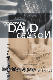
David Carson is an American graphic designer who is well known for using experimental typography and innovative magazine design.He also is one of the most influential graphic designer of the nineties.He was named "father of grunge",because using "dirty"type and non-mainstream is his signature style.

He is a controversial designer, some people crazy to admire him and follow his style ,but some are avoid his work like the plague ,and some are accused his work the "dirty"type.some paranoid person who's situation in traditional visual design field has sniffy attitude to his "non-professional" design. They accuse that his work violated the standards which experience formed for a long period by design industry.and they worry that the younger generation will lost in design because suffer his influence.During the time he was disputed , in one side , he was criticized by the senior designer who is entrenched design standard , on the other side ,he was accepted invitation of numerous of well-know media,and notification of gaining prize.it's a competition between the sensibility and rationality,but no standard can stop the realization of creative ideas.

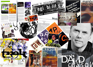
 This is <THE END OF PRINT;THE GRAPHIC DESIGN OF CARSON>, Carson's well known book,which has sold more than 125,000 in world.The book totally broke all the pretty neat design of before,no matter the layout , typographic,typeface or the colour of this book is really broke the the style before.it let design go a huge step towards a direction that design as you desire.
David Carson is an American graphic designer who is well known for using experimental typography and innovative magazine design.He also is one of the most influential graphic designer of the nineties.He was named "father of grunge",because using "dirty"type and non-mainstream is his signature style.

He is a controversial designer, some people crazy to admire him and follow his style ,but some are avoid his work like the plague ,and some are accused his work the "dirty"type.some paranoid person who's situation in traditional visual design field has sniffy attitude to his "non-professional" design. They accuse that his work violated the standards which experience formed for a long period by design industry.and they worry that the younger generation will lost in design because suffer his influence.During the time he was disputed , in one side , he was criticized by the senior designer who is entrenched design standard , on the other side ,he was accepted invitation of numerous of well-know media,and notification of gaining prize.it's a competition between the sensibility and rationality,but no standard can stop the realization of creative ideas.

Carson was doing work for Pepsi Cola, Ray Ban (orbs project), Nike, Microsoft,Budweiser, Giorgio Armani, NBC, American Airlines and Levi Strauss Jeans, and later worked for a variety of new clients, including AT&T, British Airways, Kodak, Lycra,Packard Bell, Sony, Suzuki, Toyota, Warner Bros., CNN, Cuervo Gold, Johnson AIDS Foundation, MTV Global, Princo, Lotus Software, Fox TV, Nissan, quiksilver, Intel,Mercedes-Benz, MGM Studios and Nine Inch Nails. He, along with Tina Meyers, designed the "crowfiti" typeface used in the film The Crow: City of Angels. He acted as the original design consultant for the tourism magazine Blue in 1997. Christa Skinner art directed and designed the magazine.
 This is <THE END OF PRINT;THE GRAPHIC DESIGN OF CARSON>, Carson's well known book,which has sold more than 125,000 in world.The book totally broke all the pretty neat design of before,no matter the layout , typographic,typeface or the colour of this book is really broke the the style before.it let design go a huge step towards a direction that design as you desire.
订阅:
评论 (Atom)


